Services
The Services page provides a catalog of all instrumented services along with their health metrics, operations, and dependencies.
Accessing the Services page
Section titled “Accessing the Services page”- Open OpenSearch Dashboards.
- Navigate to Observability > Application Monitoring > Services.
Services home page
Section titled “Services home page”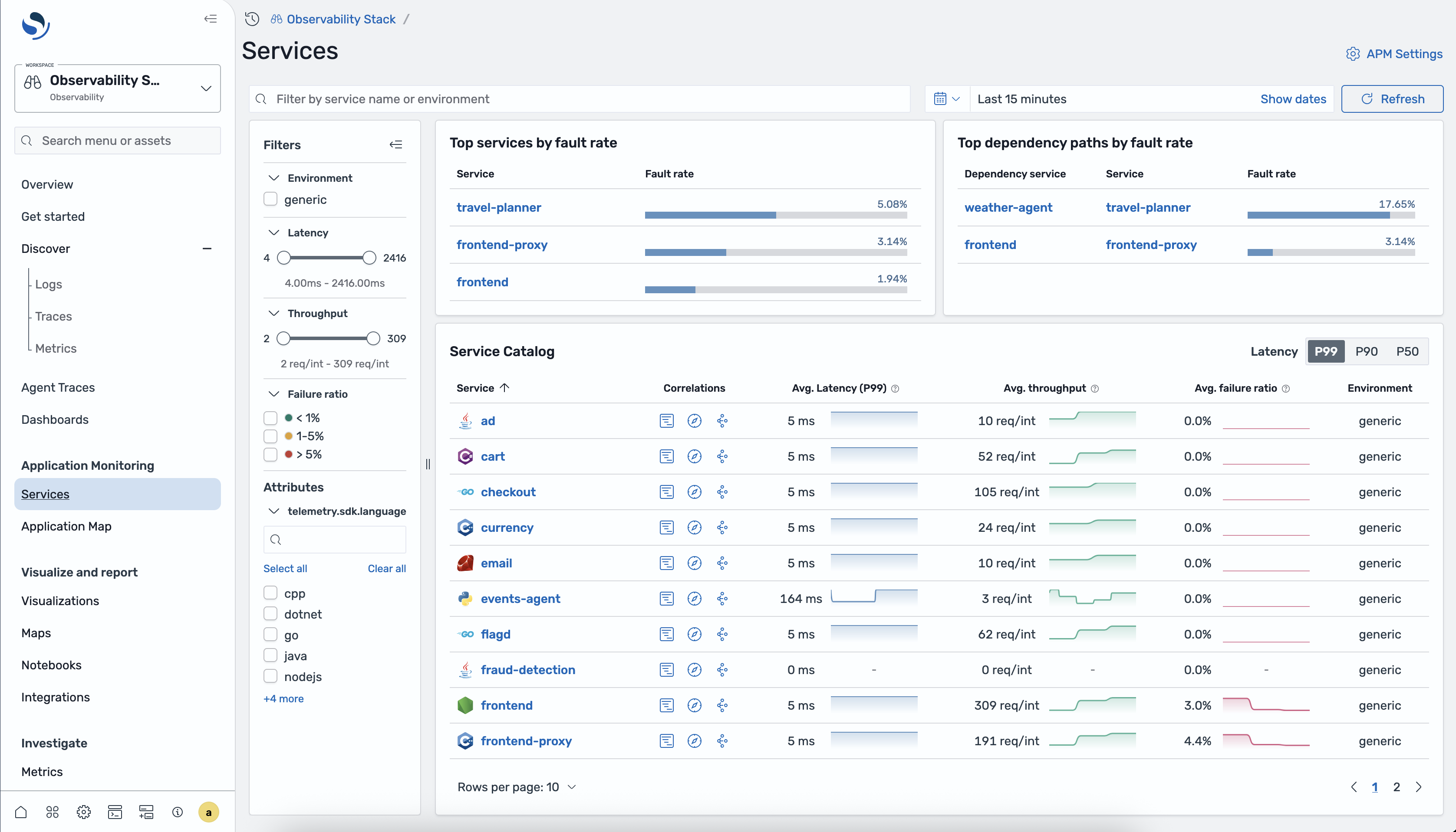
Top services by fault rate
Section titled “Top services by fault rate”A panel at the top of the page highlights the services with the highest fault rate (5xx errors), so you can quickly identify the most problematic services.
Top dependency paths by fault rate
Section titled “Top dependency paths by fault rate”A second panel shows the dependency paths (service → downstream service) with the highest fault rates, helping you pinpoint where failures propagate.
Service Catalog table
Section titled “Service Catalog table”The main table lists all instrumented services:
| Column | Description |
|---|---|
| Service | Service name with an icon indicating the service type |
| Correlations | Three icon buttons linking to correlated spans, logs, and service attributes |
| Avg Latency (P99) | 99th percentile latency averaged over the selected time range |
| Avg throughput | Average request throughput, displayed as a bar chart |
| Avg failure ratio | Average failure ratio, displayed as a bar chart |
| Environment | The deployment environment for the service |
Filters sidebar
Section titled “Filters sidebar”Use the left-hand filters to narrow down the catalog:
- Environment — filter by deployment environment
- Latency — range slider to set minimum and maximum latency thresholds
- Throughput — range slider to set minimum and maximum throughput thresholds
- Failure ratio — bucket filters: < 1%, 1–5%, > 5%
- Attributes — filter by resource attributes such as
telemetry.sdk.language
Service detail view
Section titled “Service detail view”Click a service name to open its detail view. The detail view has three tabs: Overview, Operations, and Dependencies.
Overview tab
Section titled “Overview tab”The Overview tab gives you a high-level picture of the service’s health and behavior.
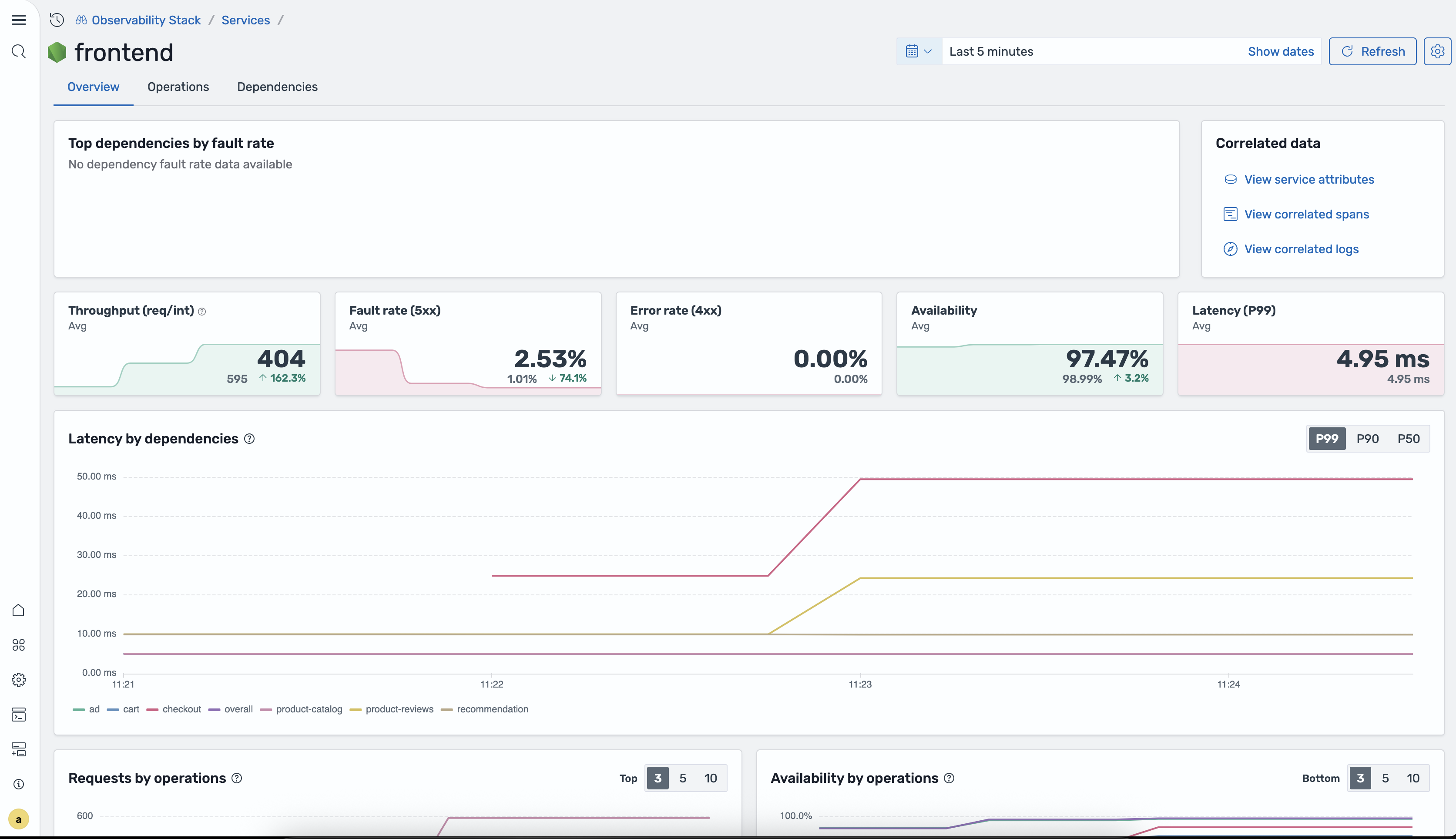
Top dependencies by fault rate A panel showing which downstream dependencies have the highest fault rates for this service.
Correlated data Quick links to related telemetry:
- View service attributes — resource attributes attached to the service
- View correlated spans — spans associated with this service
- View correlated logs — logs correlated to this service’s traces
KPI cards Five cards summarizing key performance indicators, each with a sparkline chart, the current value, the previous-period value, and a trend arrow:
| KPI | Description |
|---|---|
| Throughput | Requests per interval |
| Fault rate (5xx) | Percentage of requests returning 5xx status codes |
| Error rate (4xx) | Percentage of requests returning 4xx status codes |
| Availability | Percentage of successful (non-error) requests |
| Latency (P99) | 99th percentile response time |
Latency by dependencies chart A time-series chart showing latency broken down by downstream dependency. Toggle between P99, P90, and P50 percentiles.
Requests by operations chart A chart showing request volume per operation. Toggle between Top 3, Top 5, and Top 10 operations.
Availability by operations chart A chart showing availability per operation. Toggle between Bottom 3, Bottom 5, and Bottom 10 operations.
Operations tab
Section titled “Operations tab”The Operations tab lists every operation for the service.
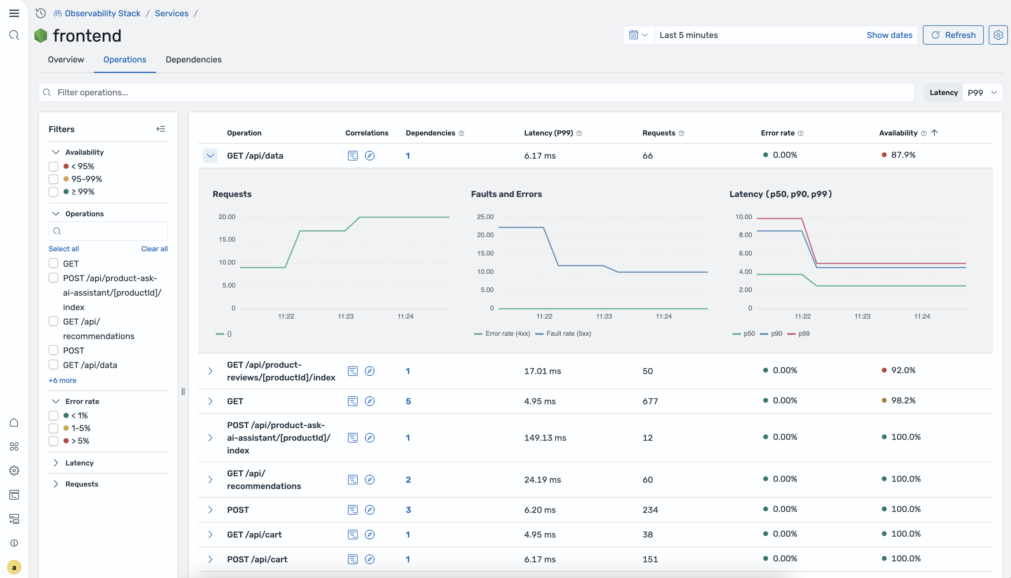
Operations table
| Column | Description |
|---|---|
| Operation | The operation name (e.g., GET /api/users) |
| Correlations | Icon buttons to open the correlation flyout |
| Dependencies | Number of downstream dependencies for this operation |
| Latency (P99) | 99th percentile latency |
| Requests | Total request count |
| Error rate | Percentage of requests with errors |
| Availability | Percentage of successful requests |
Expandable rows Click a row to expand it and see inline charts:
- Requests / Faults — request volume and 5xx fault count over time
- Errors / Latency — error count and latency (P50, P90, P99) over time
Filters sidebar
- Availability — bucket filters for availability ranges
- Operations — search box to filter by operation name
- Error rate — filter by error rate range
- Latency — filter by latency range
- Requests — filter by request count range
- Service operations — filter to specific service-side operations
- Remote operations — filter to specific remote (downstream) operations
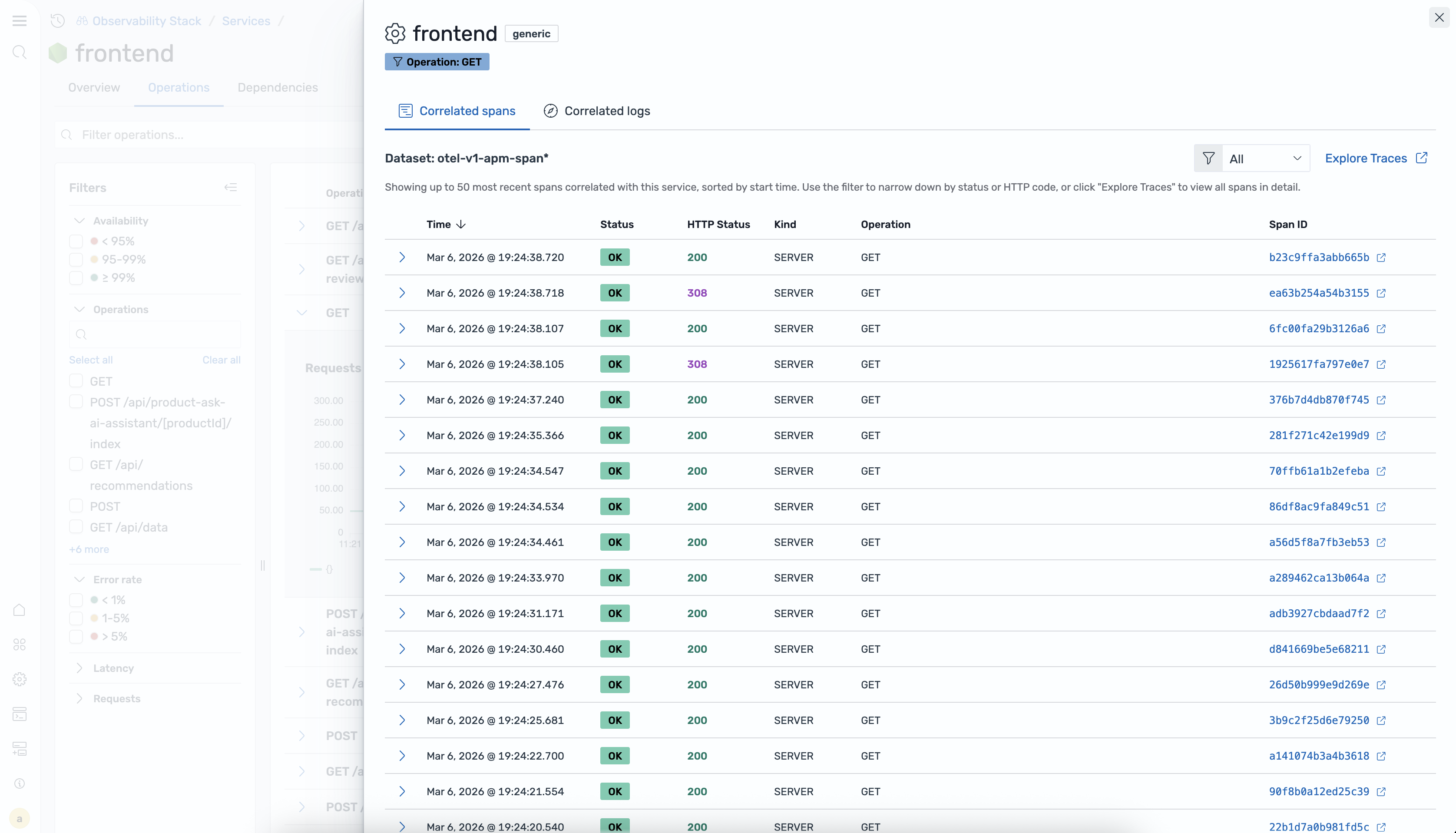
Correlation flyout Click a correlation icon on any operation row to open a flyout panel. The flyout header shows the service name, environment badge, and operation filter badge. It contains two tabs:
- Correlated spans — a table of spans with columns for Time, Status (OK/ERROR badge), HTTP Status, Kind, Operation, and Span ID. The Span ID is a clickable link that navigates to the span in Explore Traces.
- Correlated logs — a table of log entries correlated to the selected operation.
Dependencies tab
Section titled “Dependencies tab”The Dependencies tab shows all downstream services that this service calls.
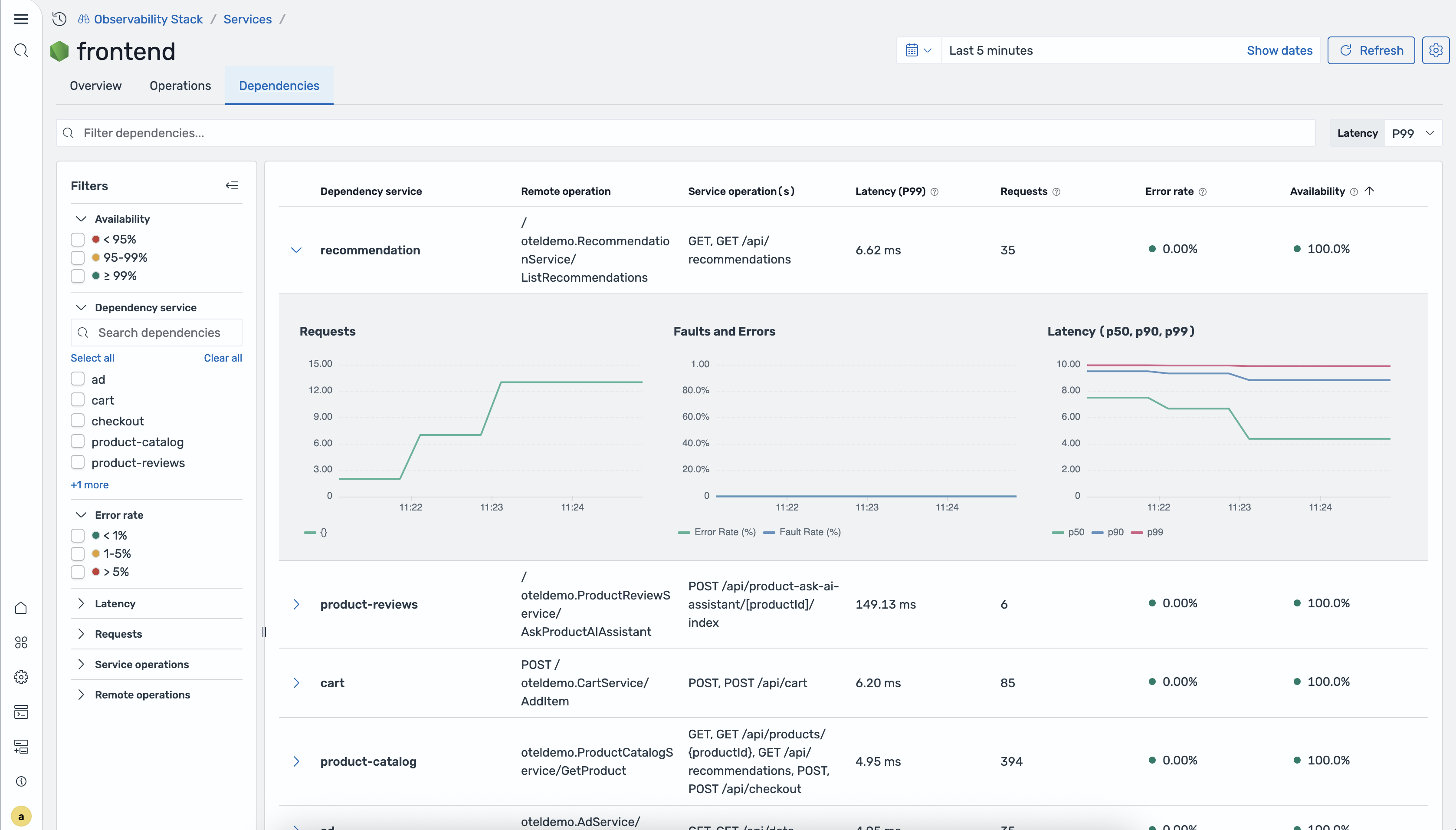
Dependencies table
| Column | Description |
|---|---|
| Dependency service | The downstream service name |
| Remote operation | The operation called on the downstream service |
| Service operation(s) | The operation(s) on this service that call the dependency |
| Latency (P99) | 99th percentile latency for this dependency path |
| Requests | Total request count for this dependency path |
| Error rate | Percentage of requests with errors |
| Availability | Percentage of successful requests |
Expandable rows Click a row to expand it and see inline charts for request volume, errors, and latency over time.
Filters sidebar
- Availability — bucket filters for availability ranges
- Dependency service — search box to filter by dependency name
- Error rate — filter by error rate range
How service data is generated
Section titled “How service data is generated”Service data comes from the same Data Prepper pipeline that generates the Application Map. The otel_apm_service_map processor extracts service relationships from trace spans and indexes topology data into OpenSearch. RED metrics are exported to Prometheus via remote write, where they power the time-series charts and KPI cards in the Services views.