

Discover Logs
The Logs page in OpenSearch Dashboards is a log analytics tool that allows you to explore and analyze application logs using Piped Processing Language (PPL). On this page, you can query log data, create visualizations from aggregated results, and add these visualizations to dashboards.
The Logs page provides the following capabilities:
- PPL-based querying: Use PPL syntax to filter, aggregate, and transform log data.
- Visual query building: Build queries from menus with the PPL Query Builder, writing no PPL.
- Automatic visualization: When you use aggregation commands like
stats, the interface automatically switches to a visualization view. - Multiple visualization types: Choose from various visualization types.
- Dashboard integration: Save visualizations directly to new or existing dashboards.
- Query management: Save queries for reuse and access recent queries.
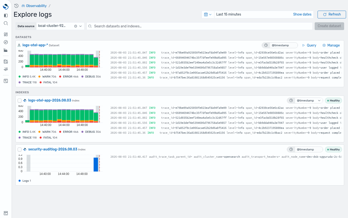
Accessing the Logs page
Section titled “Accessing the Logs page”To access the Logs page:
- Navigate to an observability workspace in OpenSearch Dashboards.
- In the left navigation, expand Discover and select Logs.
Exploring log data
Section titled “Exploring log data”The Logs page is shown in the following image.
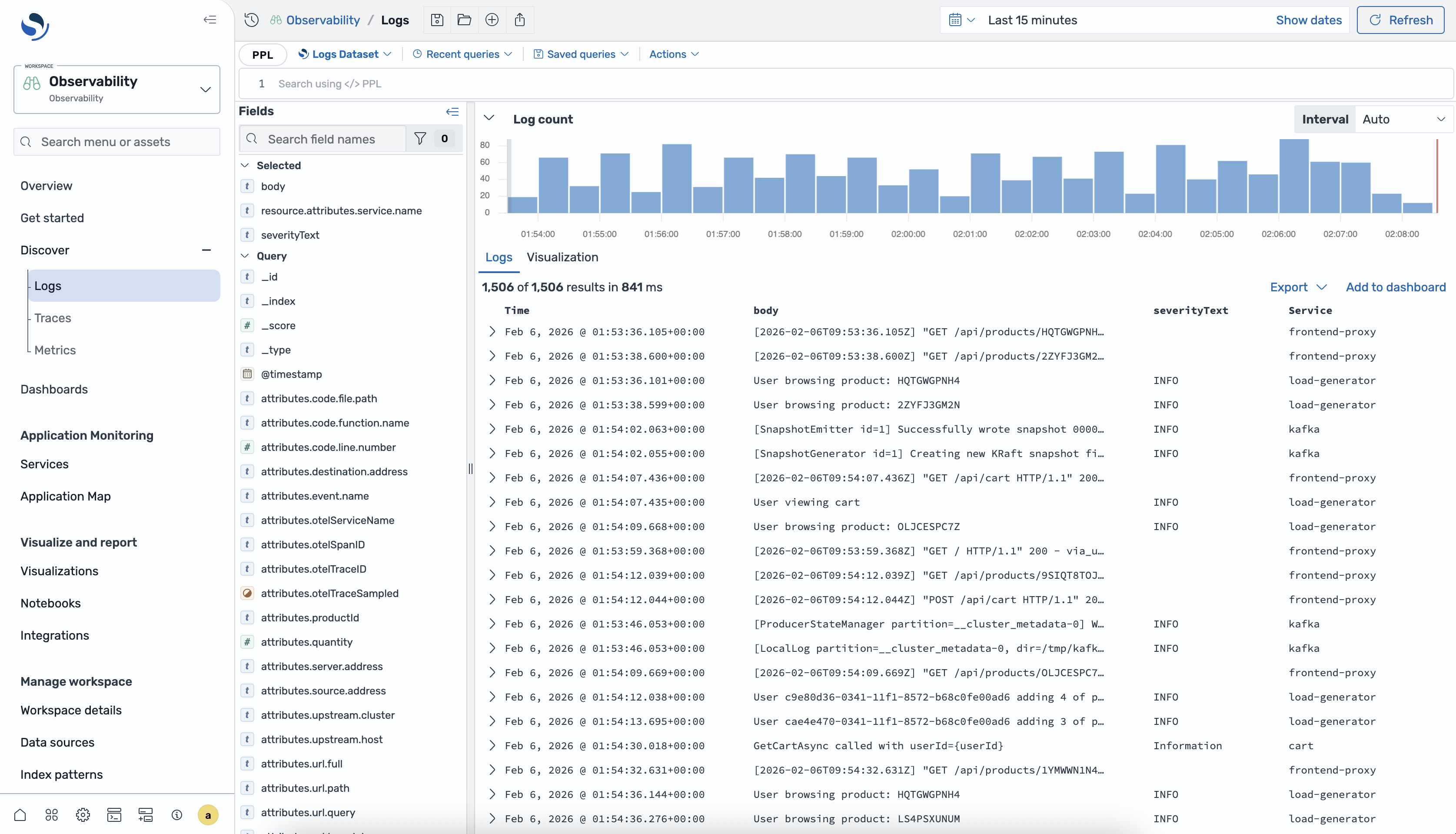
It consists of the following components:
- PPL editor: The query bar at the top where you write PPL queries.
- Dataset selector: Select the logs dataset to explore from the dropdown list at the top of the page.
- Recent queries: Access previously run queries at the top of the page.
- Saved queries: Access queries you have saved for reuse at the top of the page.
- Fields: Located on the left side, the Fields panel displays available fields organized into Selected fields and Query fields sections.
- Log count: The Log count histogram shows the distribution of log entries over time. Use the Interval selector to adjust the time bucket size.
- Results area: Displays query results with two tabs:
- Logs: Shows individual log entries in a table format.
- Visualization: Displays aggregated data as charts when using
statscommands.
- Time range selector: Located in the upper-right corner, allows you to set the time range for your query.
Querying logs using PPL
Section titled “Querying logs using PPL”You can use PPL for querying log data. PPL allows you to chain commands using the pipe character (|) to filter, transform, and aggregate data.
Basic queries
Section titled “Basic queries”To retrieve all logs from your dataset, run a query without any filters by entering a query and selecting Refresh. The results appear in the Logs tab showing individual log entries.
Filtering using the WHERE clause
Section titled “Filtering using the WHERE clause”Use the WHERE clause to filter logs based on field values:
| WHERE `resource.attributes.service.name` = 'frontend-proxy'You can combine multiple conditions by providing several WHERE clauses:
| WHERE `resource.attributes.service.name` = 'frontend-proxy'| WHERE `attributes.url.path` in ("/api/cart","/api/checkout")Managing queries
Section titled “Managing queries”The Logs page provides tools to help you organize and reuse your PPL queries efficiently.
- Recent queries: Select Recent queries to view and rerun previously executed queries.
- Saved queries: Select Saved queries to access queries you have saved. To save the current query, select Actions > Save query.
Building queries with the PPL Query Builder
Section titled “Building queries with the PPL Query Builder”The PPL Query Builder gives you a visual editing surface for PPL on the Logs page. You pick fields and values from menus, and the builder compiles the PPL. It covers a subset of PPL: search, filter, aggregate, and sort. For anything outside that subset, switch to Code mode and write the PPL by hand.
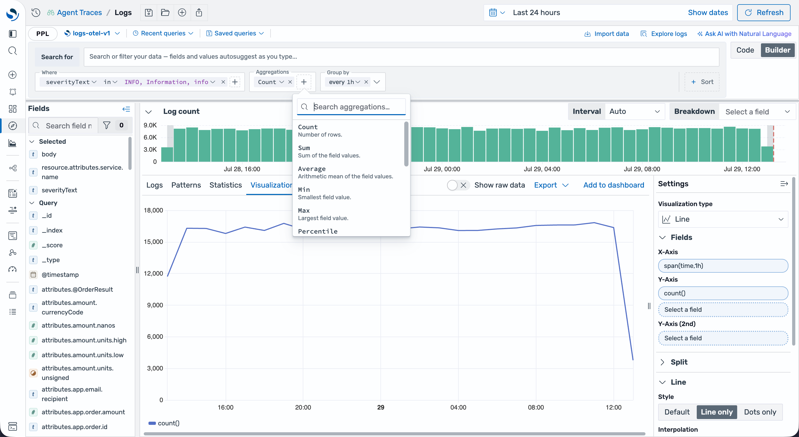
Builder mode and Code mode
Section titled “Builder mode and Code mode”You edit a logs query in one of two modes. The Code / Builder toggle at the upper right of the query panel switches between them.
| Mode | Description |
|---|---|
| Builder | The visual surface: a search box plus Where, Aggregations, Group by, and Sort by controls. |
| Code | The raw PPL editor, with syntax highlighting and autocomplete. Handles anything the builder cannot represent. |
A new logs query opens in Builder mode. A query loaded from a saved search opens in Code mode, and you can switch to Builder from there.
Switching between modes
Section titled “Switching between modes”A query you build in Builder mode moves freely between the two modes. Switch Builder → Code and the editor opens with the PPL the builder generated, so you can build a query by clicking and then read the PPL behind it. Switch back and your builder controls return as they were.
Once you write or edit PPL in Code mode, the query stays in Code. Builder greys out, and its tooltip reads “This query cannot be represented in Builder mode. Simplify it or use Code mode.”
Clear the query bar to start fresh in Builder.
Searching
Section titled “Searching”The Search for box at the top of the builder edits the PPL search expression. A dedicated search-expression grammar drives its autocomplete, so it offers what parses at your cursor:
- Field names from the current dataset. Accepting one inserts
field=and re-opens the suggestion list. - Live field values for the field you named, pulled from the index.
- Operators
=,!=,>,>=,<,<=. - Keywords
AND,OR,NOT, andIN.
Two conditions side by side with no operator between them combine with AND. Precedence follows PPL: parentheses bind tightest, then NOT, then OR, then AND. This differs from SQL. See search for the details.
Filtering with Where
Section titled “Filtering with Where”The Where row holds filter chips, and each chip compiles to one where command. Select Where to add a chip, then pick a field, an operator, and one or more values. The value menu lists live values from the index, so you filter on values you can see.
The field’s mapped type determines which operators you get:
| Operator | Applies to | Compiles to |
|---|---|---|
| is | any field | `field` = value |
| is not | any field | `field` != value |
| is one of | string, number, date, ip, geo | `field` = a OR `field` = b |
| is not one of | string, number, date, ip, geo | `field` != a AND `field` != b |
| is between | number, date, ip | `field` >= from AND `field` < to |
| is not between | number, date, ip | `field` < from OR `field` >= to |
| exists | any field | ISNOTNULL(`field`) |
| does not exist | any field | ISNULL(`field`) |
Ranges are half-open: from is inclusive, to is exclusive. Fill in one side and the chip emits that single comparison.
Hover a chip to see the predicate it emits. A chip with a field but no value yet contributes nothing to the query and shows “Finish this condition”.
Aggregating
Section titled “Aggregating”Select Aggregation to add a metric, then Group by to bucket it. Together they compile to a single stats command.
Metrics cover count, sum, avg, min, max, median, percentile, distinct_count, and the standard deviation and variance pairs. Each one that takes a field also offers a Wrap in function menu of math, string, and date functions to apply before aggregating.
Group by one or more fields, and add Over time for a span() time bucket on the dataset’s time field. The builder sizes that interval to your current time range, and you can override it.
Sorting
Section titled “Sorting”The Sort control adds a single sort command with a Desc or Asc direction. On a plain query you sort on any field; once the query aggregates, you sort on a column it emits, either a metric such as count() or one of the group-by fields.
Running the query
Section titled “Running the query”Select Refresh, or press Cmd/Ctrl + Enter from anywhere in the builder.
Your edits do not run the query as you type. The builder holds the generated query as a draft until you run it, so the results table and histogram keep showing the last query you ran.
Worked example
Section titled “Worked example”This builder configuration:
- Search for:
`resource.attributes.service.name`=frontend-proxy - Where:
attributes.http.response.status_codeis between500and600 - Aggregations:
Count - Group by:
attributes.url.path, over time every1m - Sort by:
count(),Desc
generates:
`resource.attributes.service.name`=frontend-proxy| WHERE `attributes.http.response.status_code` >= 500 AND `attributes.http.response.status_code` < 600| stats count() by `attributes.url.path`, span(time, 1m)| sort -`count()`Because the query aggregates, the Logs page switches to the Visualization tab to chart the result.
Creating visualizations from logs
Section titled “Creating visualizations from logs”When you use the stats command to aggregate data, the Logs page automatically switches to the Visualization tab to display the results as a chart.
Using the stats command
Section titled “Using the stats command”The stats command aggregates data based on specified fields. For example, to count logs per minute grouped by URL path, use the following query:
| WHERE `resource.attributes.service.name` = 'frontend-proxy'| WHERE `attributes.url.path` in ("/api/cart","/api/checkout")| STATS count() by span(time, 1m), `attributes.url.path`When you run this query, the interface automatically switches to the Visualization tab and displays a chart.
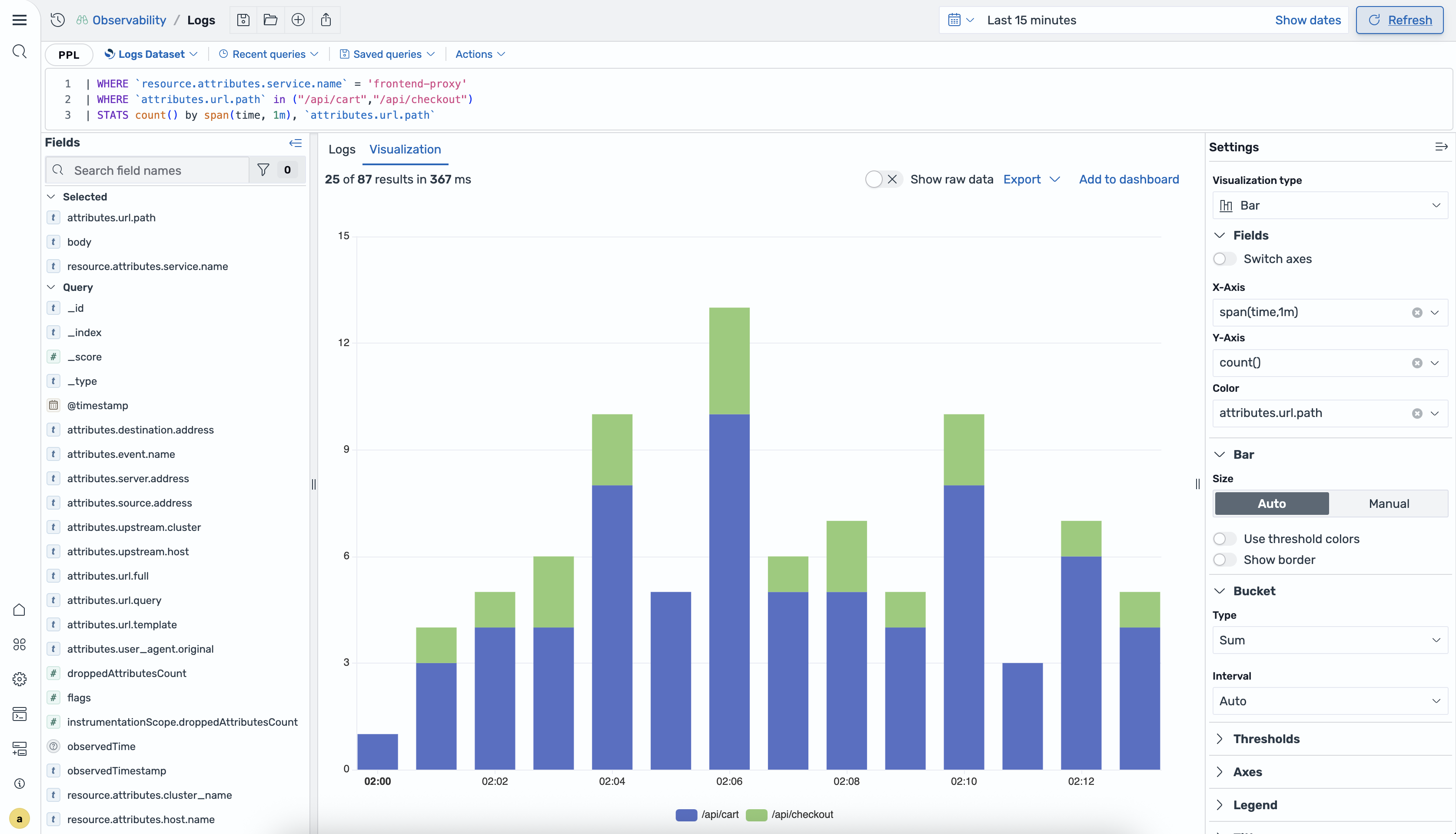
Visualization types
Section titled “Visualization types”To change the visualization type, go to Settings > Visualization type and select one of the available options.
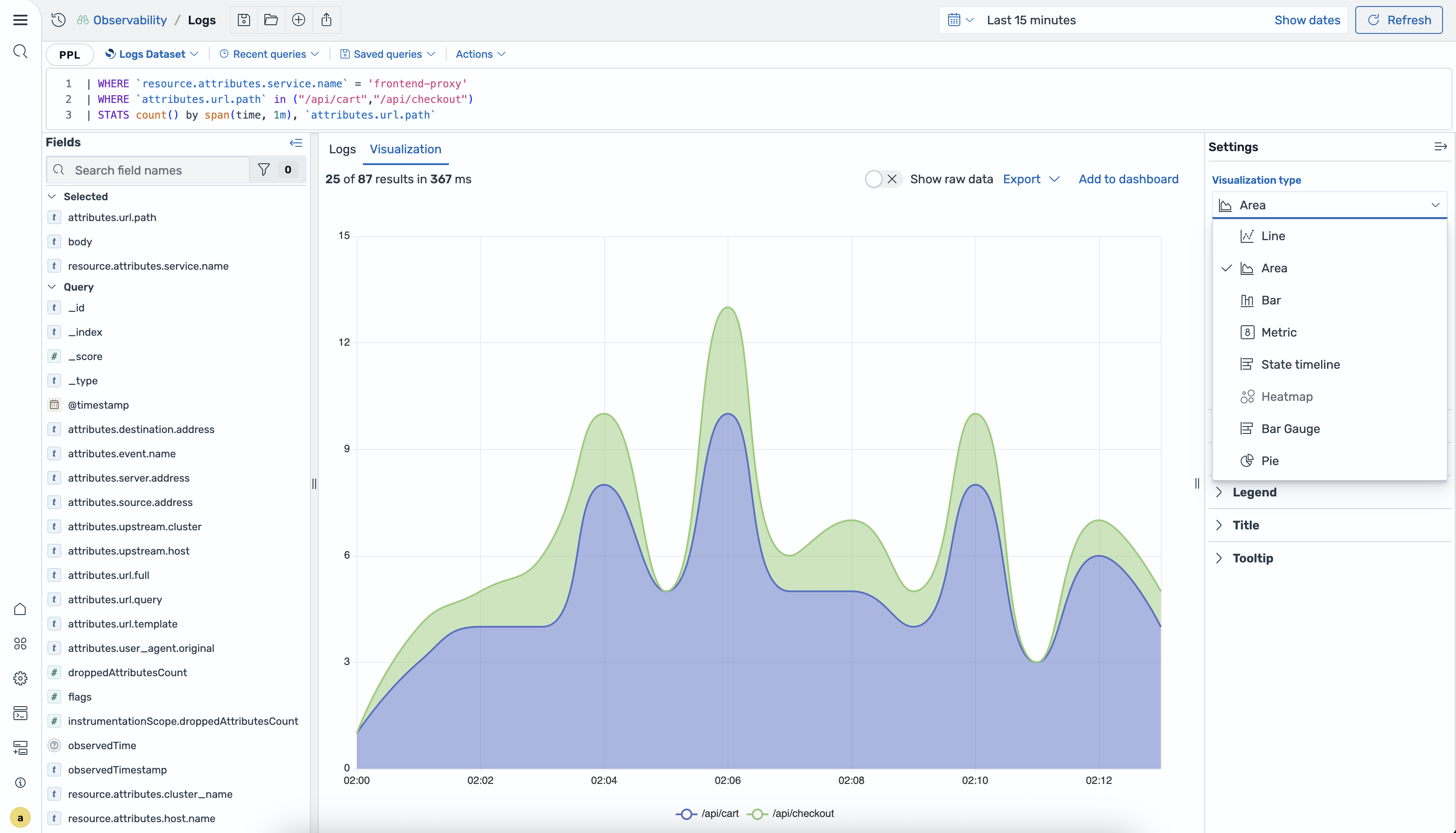
The following visualization types are available.
| Type | Description |
|---|---|
| Line | Displays data as connected points; ideal for showing trends over time. |
| Area | Similar to line charts but with the area below the line filled in. |
| Bar | Displays data as vertical or horizontal bars for comparing categories. |
| Metric | Shows a single aggregated value as a large number. |
| State timeline | Displays state changes over time on a horizontal timeline. |
| Heatmap | Uses color intensity to represent values in a matrix format. |
| Bar Gauge | Displays values as horizontal bars with configurable thresholds. |
| Pie | Shows proportions as slices of a circular chart. |
Visualization settings
Section titled “Visualization settings”To customize your visualization, update the options in the Settings panel.
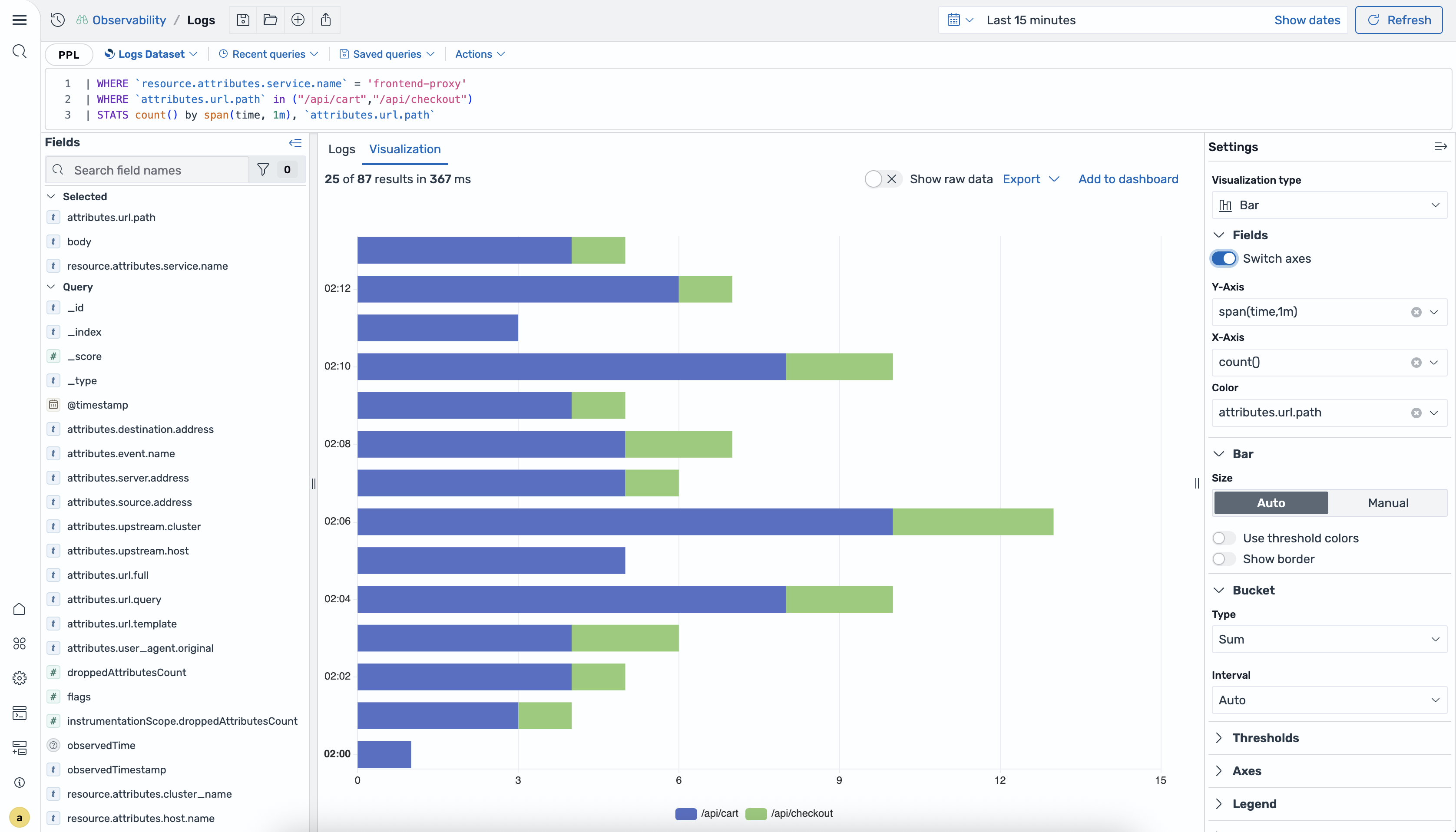
You can update the following options:
- Fields: Configure the fields to display on the X-Axis, Y-Axis, and Color (for grouping data series by different values). For bar charts, you can toggle Switch axes in the Fields section to change the chart orientation from vertical to horizontal (swap X and Y axes).
- Bar/Bucket: For bar charts, configure bar size (Auto or Manual) and bucket settings (Type and Interval).
- Thresholds: Define value thresholds using custom colors.
- Axes: Configure axes labels, scales, and formatting.
- Legend: Control legend visibility and position.
Adding visualizations to dashboards
Section titled “Adding visualizations to dashboards”You can save your visualizations directly to dashboards for ongoing monitoring using the following steps:
-
After creating a visualization, select Add to dashboard in the results area.
-
In the Save and Add to Dashboard dialog, choose one of the following options:
- Save to existing dashboard: Select an existing dashboard from the dropdown.
- Save to new dashboard: Enter a name for the new dashboard.
-
Enter a name for the saved search in the Save search field.
-
Select Add to save the visualization to the dashboard.