Application Map
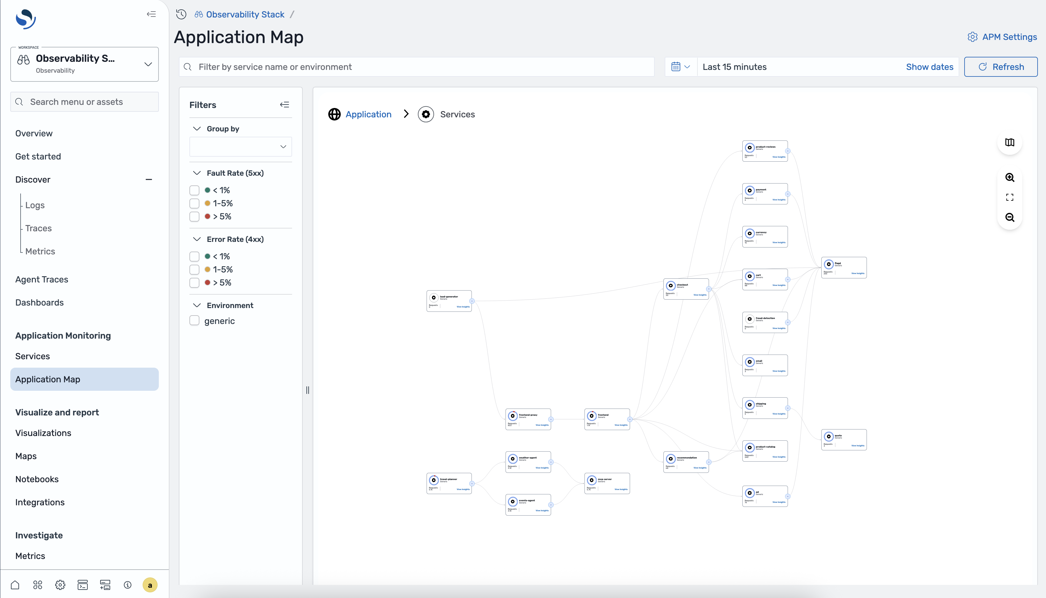
The Application Map is an interactive topology view of your distributed system, auto-generated from trace data by Data Prepper. It shows which services communicate, how much traffic flows between them, and where errors are occurring.
Accessing the Application Map
Section titled “Accessing the Application Map”- Open OpenSearch Dashboards.
- Navigate to Observability > Application Monitoring > Application Map.
The breadcrumb at the top reads Application > Services, reflecting the current navigation level.
Map controls
Section titled “Map controls”The Application Map toolbar provides:
- Search bar - filter by service name or environment
- Time range selector - choose a time window, with a Refresh button
- Zoom in / Zoom out - adjust the map zoom level
- Fit to screen - reset the view to fit all nodes
Filters panel
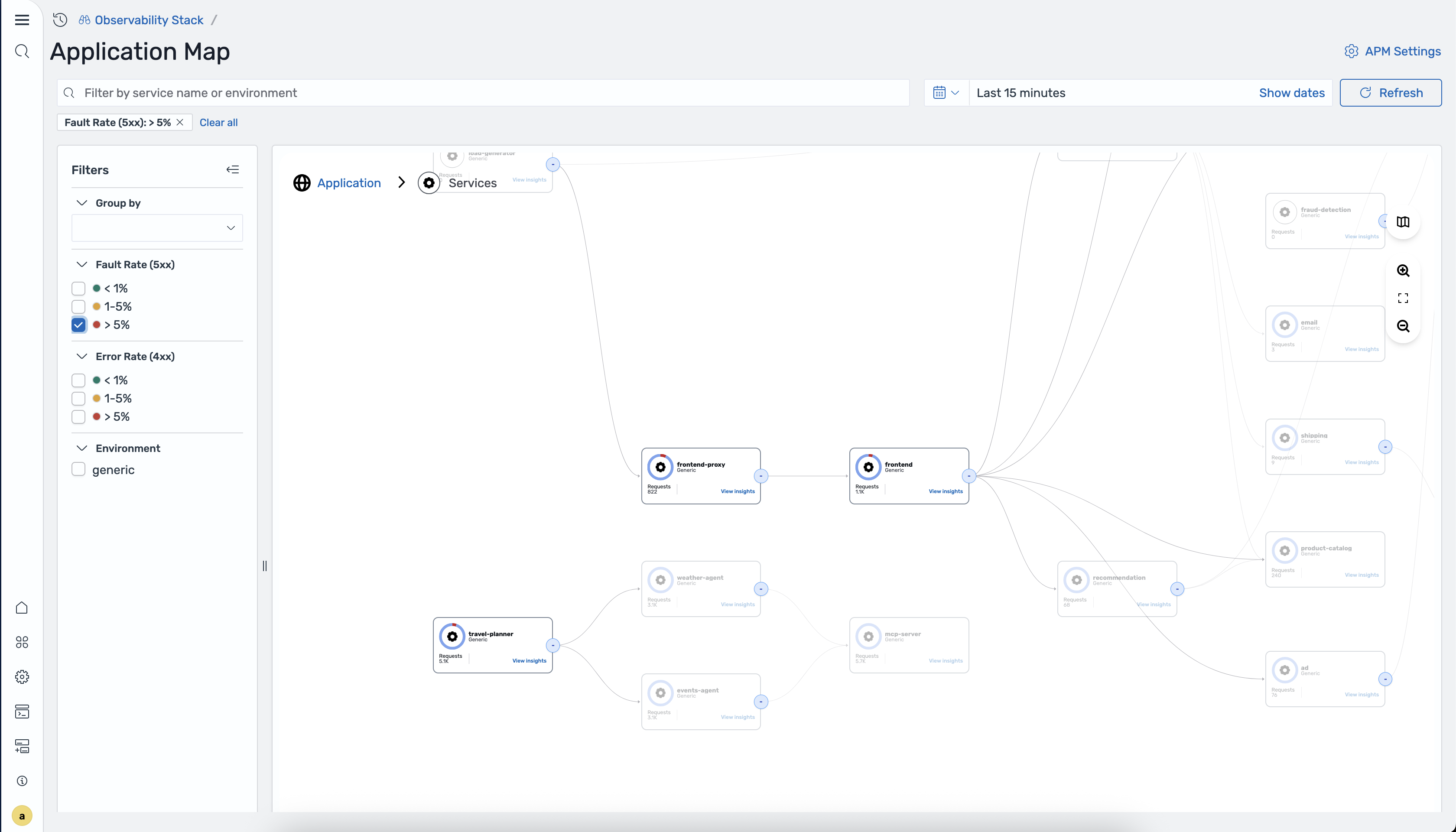
Section titled “Filters panel”A filters panel on the left side lets you narrow what the map displays:
- Group by - select an attribute to group services (see Group by view below)
- Fault Rate (5xx) - filter by fault rate buckets: < 1%, 1–5%, > 5%
- Error Rate (4xx) - filter by error rate buckets: < 1%, 1–5%, > 5%
- Environment - filter to a specific deployment environment
Applied filters appear as chips above the map (e.g., “Fault Rate (5xx): > 5% x”). Click the x on a chip to remove it, or click Clear all to reset all filters.
Service nodes
Section titled “Service nodes”Each node on the map represents an instrumented service and displays:
- Service name
- Environment label
- Request count
- A View Insights link
Edges between nodes show the direction of communication between services.
Clicking a service node
Section titled “Clicking a service node”Click any service node to open a detail panel on the right side of the map. The panel shows:
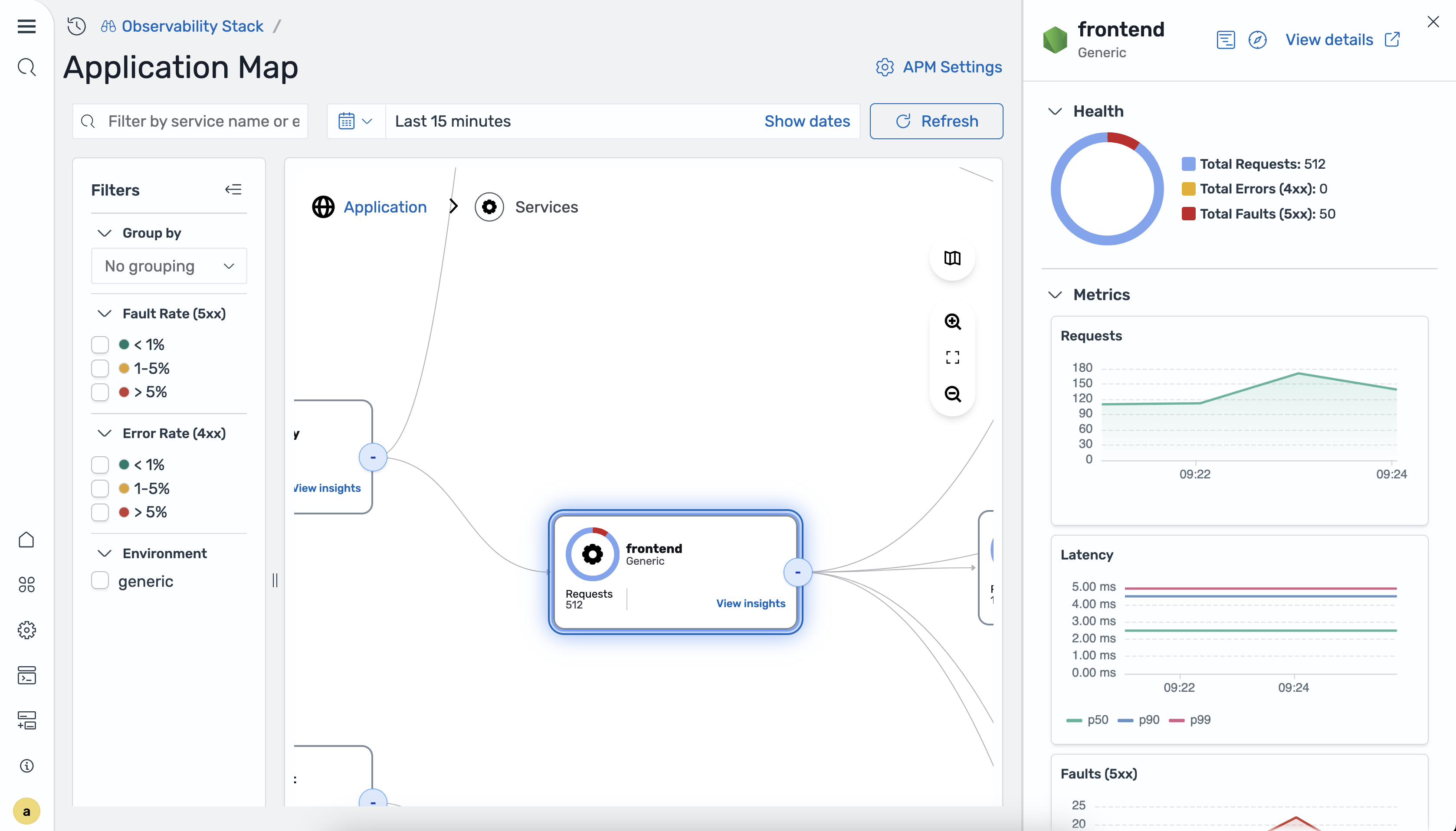
Header
- Service name and environment label
- A View details link that navigates to the full service detail view
Health
- A donut chart breaking down total traffic into:
- Total Requests
- Total Errors (4xx)
- Total Faults (5xx)
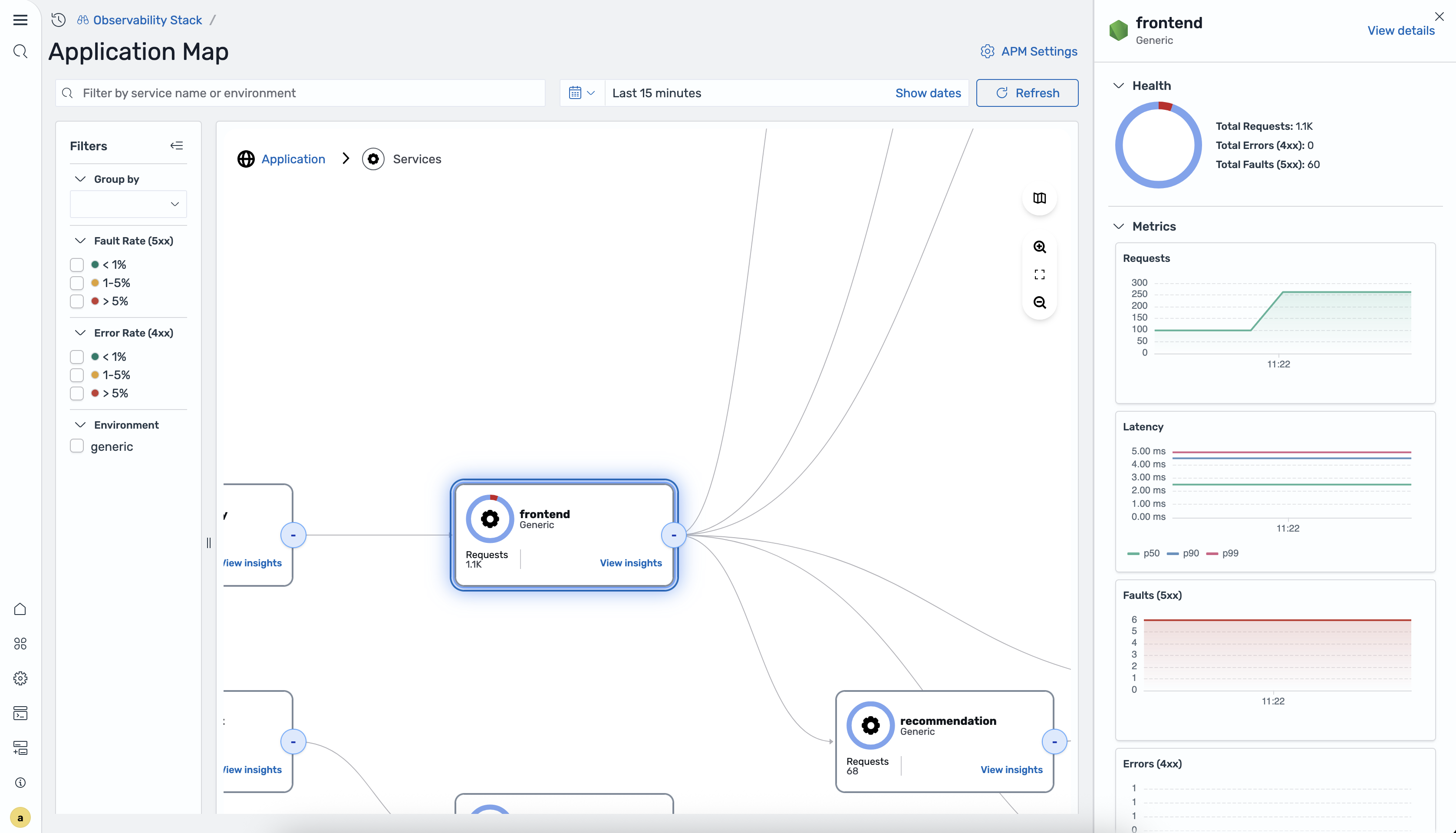
Metrics Four time-series charts for the selected time range:
- Requests - request volume over time
- Latency - P50, P90, and P99 latency lines
- Faults (5xx) - 5xx fault count over time
- Errors (4xx) - 4xx error count over time
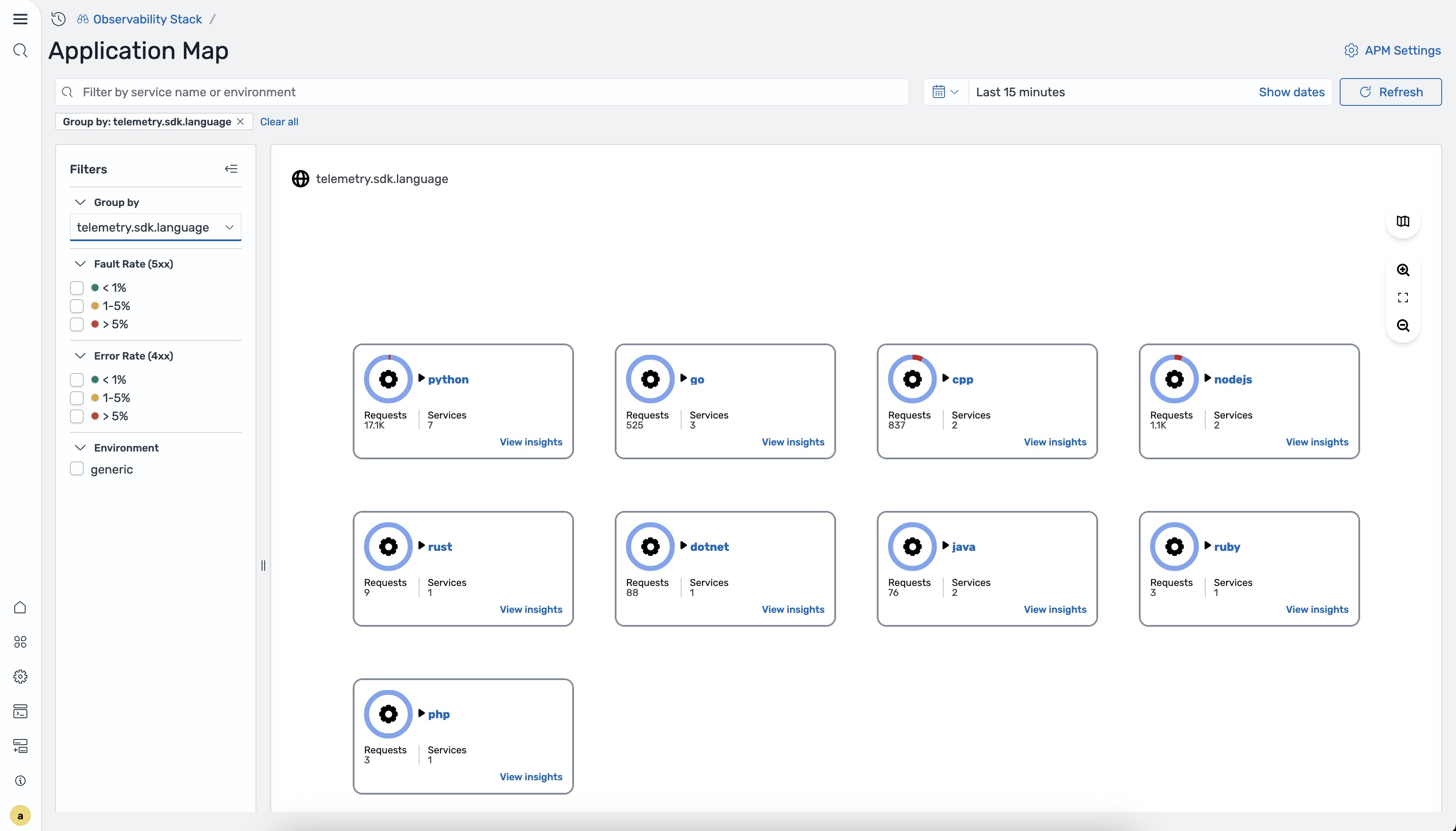
Group by view
Section titled “Group by view”The Group by dropdown in the filters panel lists any attribute configured in Data Prepper’s group_by_attributes for the otel_apm_service_map processor. For example, if your pipeline includes:
- otel_apm_service_map: group_by_attributes: - telemetry.sdk.languagethen “telemetry.sdk.language” appears as a Group by option.
When a group-by attribute is selected, the map switches from a topology graph to a card grid. Each card represents one group value and shows:
- Group value name (e.g., “python”, “java”)
- A donut chart icon
- Requests count
- Services count
- A View insights link
Clicking View insights on a group card drills into that group, showing only the services matching that attribute value.
In-context correlations
Section titled “In-context correlations”The application map integrates with APM correlations to help you navigate from the topology view to detailed telemetry data:
- Application spans - select a service node and choose View traces to see the individual trace spans associated with that service. This is useful for investigating the root cause of latency or error spikes visible on the map.
- Application logs - select a service node and choose View logs to see log entries from that service during the selected time range. Log correlations require that you have configured a correlation between your trace and log datasets.
These in-context navigation paths allow you to move seamlessly from a high-level topology view to the detailed traces and logs needed for root cause analysis.
Data Prepper pipeline configuration
Section titled “Data Prepper pipeline configuration”The Application Map is generated by Data Prepper’s otel_apm_service_map processor. For the complete pipeline configuration, see Configuring Telemetry Ingestion.