Creating visualizations using queries
The visualization editor lets you create visualizations by writing Piped Processing Language (PPL) or Prometheus Query Language (PromQL) queries. The editor automatically maps query result fields to chart axes and suggests a chart type based on the shape of your data.
The OpenSearch Observability Stack includes the required OpenSearch Dashboards capabilities and data source connections out of the box. After the stack is running, open OpenSearch Dashboards and create visualizations from Discover or from a dashboard.
Example data
Section titled “Example data”The examples in this section use OpenSearch Dashboards sample datasets such as opensearch_dashboards_sample_data_logs and opensearch_dashboards_sample_data_flights. If you are visualizing telemetry produced by the Observability Stack, replace the sample dataset and field names with your logs, traces, or metrics datasets.
Navigating the visualization editor UI
Section titled “Navigating the visualization editor UI”The following image shows the visualization editor interface.
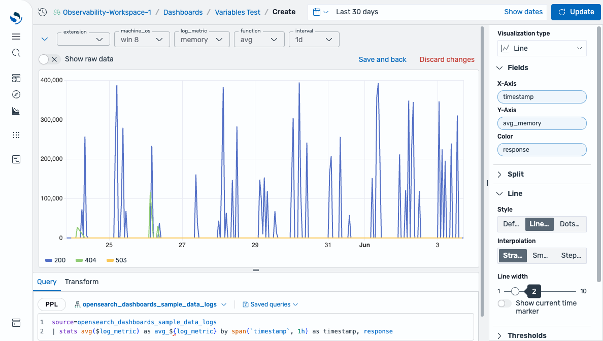
- The time filter (A) selects the time range for query results.
- The Update button (B) runs or refreshes the query.
- The query editor (C) is where you write PPL queries.
- The Saved queries dropdown (D) saves and loads reusable queries.
- The configuration panel (E) contains the chart type selector, field mappings, and style settings.
Creating a visualization
Section titled “Creating a visualization”To open the visualization editor, use one of the following methods:
- From the left navigation menu, select Explorer > Logs, then select the Visualization tab.
- From a dashboard, select the add panel icon, then select Add visualization.
To create a visualization, follow these steps:
-
Select a dataset from the dataset selector in the query bar (for example, opensearch_dashboards_sample_data_logs).
-
Write a PPL query in the query editor. If you selected a dataset, start the query with a pipe character (
|). Otherwise, specify the source explicitly usingsource =. For example, the following query counts log events per hour:source = opensearch_dashboards_sample_data_logs | stats count() by SPAN(@timestamp, 1h)If
opensearch_dashboards_sample_data_logsis already selected as the dataset, you can omit thesource:| stats count() by SPAN(@timestamp, 1h) -
Select Update or press Enter to run the query.
-
The editor automatically selects a chart type and maps fields to axes based on your query results. To change the chart type, use the Visualization type dropdown.
-
To customize the field mapping, use the Fields panel.
Using dashboard variables
Section titled “Using dashboard variables”You can use dashboard variables to create dynamic, interactive visualizations. Variables let you switch between filter values, metrics, time intervals, and aggregation functions without editing the query. Reference variables in your PPL or PromQL queries using $variableName or ${variableName} syntax.
For more information, see Dashboard variables.
Saving a visualization
Section titled “Saving a visualization”To save a visualization, select Save (or Save and back if you opened the editor from a dashboard). Enter a name for the visualization and select Save.
If you opened the visualization editor from a dashboard, the visualization is automatically added to that dashboard after saving. If you created the visualization from Explorer > Logs, save it first, then add it to a dashboard manually.
Saving and reusing queries
Section titled “Saving and reusing queries”To save a PPL query for reuse, select Saved queries > Save query. In the dialog, configure the following options.
| Option | Description |
|---|---|
| Save as new query | When selected, saves the query as a new entry rather than overwriting an existing one. |
| Name | A name for the saved query. |
| Description | An optional description of the query. |
| Include filters | When enabled, saves the currently applied filters along with the query. |
| Include time filter | When enabled, saves the current time range along with the query. |
Select Save changes to save the query.
To load a previously saved query, select Saved queries > Open query, then select a query from the list and select the Open query button. The saved query is loaded into the query editor.
Visualization types
Section titled “Visualization types”The following table lists the supported visualization types and their expected data shapes.
| Chart type | Data shape |
|---|---|
| Area chart | One date field + one or more numeric fields (supports stacking) |
| Bar chart | One or more categorical or date fields + one or more numeric fields |
| Bar gauge chart | One or more numeric fields (single values) |
| Gauge chart | One numeric field (single value) |
| Heatmap | Two categorical or date fields + one numeric field |
| Histogram | One numeric field (distribution) |
| Line chart | One date field + one or more numeric fields |
| Metric chart | One numeric field (single value) |
| Pie chart | One categorical field + one numeric field |
| Scatter plot | Two or more numeric fields |
| State timeline | One date field + one categorical field (state values) |
| Table | Any combination of fields (displays raw data) |
Configuring visualizations
Section titled “Configuring visualizations”Shared configuration options (fields, split, axes, tooltip, legend, thresholds, and more) apply across multiple visualization types. For details, see Configuring visualizations in the visualization editor.