Configuring visualizations
The visualization editor provides shared configuration options that apply across multiple visualization types. Each visualization type page documents its specific options. The following configurations are common to most visualizations.
Fields
Section titled “Fields”The Fields panel maps query result columns to chart axes. Select which fields to use for the X-axis, Y-axis, and optional dimensions like color or size. Available field mappings depend on the chart type.
Use the Split option when your data has more dimensions than a single chart can display. For example, if your query returns three dimensions but a line chart can only show two (X-axis and Y-axis), use Split to create multiple charts by splitting the data along the third dimension. Each resulting chart shows the same axes but filtered to a different value of the split field.
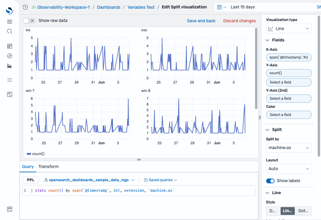
To create a split visualization, follow these steps:
-
In the dashboard, select Create new > Add visualization.
-
Select
opensearch_dashboards_sample_data_logsas the dataset. -
In the query editor, enter the following query and select Update:
| stats count() by span(`@timestamp`, 1h), extension, `machine.os` -
In the time filter, select Last 15 days.
-
Set Visualization type to Line.
-
In Fields, configure the following settings:
- X-Axis: Select
span(@timestamp,1h). - Y-Axis: Select
count().
- X-Axis: Select
-
In Split, configure the following settings:
- Split by: Select
machine.os. - Toggle Show labels to on.
- Split by: Select
The visualization displays a separate line chart for each machine.os value (for example, win xp, osx, win 7, win 8, ios), each showing the event count over time, as shown in the following image.
The X-axis and Y-axis share the same configuration options. Each axis can be independently customized.
| Setting | Description |
|---|---|
| Show axis | Shows or hides the axis. |
| Title | A custom label for the axis. |
| Position | Controls the placement of the axis relative to the chart. Supported values: X-axis: Top, Bottom. Y-axis: Left, Right. |
| Show grid lines | When enabled, shows grid lines extending from the axis into the chart area. |
| Show labels | When enabled, shows category labels along the axis. |
| Alignment | Controls the rotation of axis labels: Horizontal (0°), Vertical (90°), or Angled (45°). |
| Truncate after | Sets the maximum character length for axis labels before truncation. |
Axes are available in area, bar, heatmap, histogram, line, scatter, and state timeline charts.
Tooltip
Section titled “Tooltip”The Tooltip panel controls what information appears when you hover over a data point. Options include showing all series values or only the hovered series.
Tooltips are available in area, bar, bar gauge, heatmap, histogram, line, pie, scatter, and state timeline charts.
Legend
Section titled “Legend”The Legend panel controls the display and position of the chart legend. Options include showing or hiding the legend and selecting its position (top, bottom, left, or right).
Legends are available in heatmap, pie, scatter, and state timeline charts.
Standard options
Section titled “Standard options”Standard options control the display formatting for single-value visualizations.
| Setting | Description |
|---|---|
| Unit | The unit of measurement displayed alongside the value. |
| Decimals | The number of decimal places to display. |
Standard options are available in bar gauge, gauge, and metric charts.
Value options
Section titled “Value options”Value options control how values are calculated and displayed for single-value visualizations.
| Setting | Description |
|---|---|
| Calculation | The function used to reduce a series to a single value (for example, Last, Mean, Max, Min). For details, see Value calculations. |
| Show | Controls whether to display the calculated value, the value name, or both. |
Value options are available in bar gauge, gauge, and metric charts.
Thresholds
Section titled “Thresholds”Thresholds define color-coded boundaries that indicate when values cross important limits. For details, see Thresholds.
Value calculations
Section titled “Value calculations”Value calculations determine how a series of values is reduced to a single number for display (for example, Last, Mean, Sum, Min, Max). For details, see Value calculations.