Gauge chart
A gauge chart displays a single numeric value on a semicircular arc, making it ideal for showing how a metric compares against defined thresholds or a target range.
Creating a gauge chart
Section titled “Creating a gauge chart”The following examples build on each other, starting with a basic gauge and adding complexity.
Basic gauge chart
Section titled “Basic gauge chart”Start with a query that returns a single numeric aggregation:
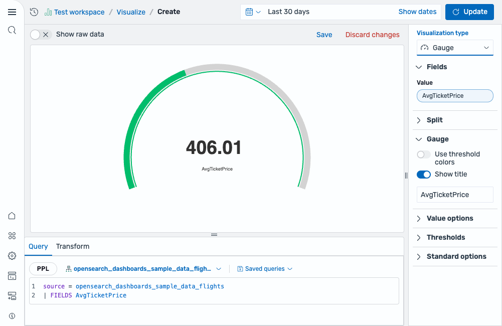
source = opensearch_dashboards_sample_data_flights | FIELDS AvgTicketPriceAfter running this query, select Gauge as the chart type. The visualization automatically applies the Last calculation to reduce the series to a single value for display. The editor maps the field as follows:
- The Value field displays the
AvgTicketPricefield (using the Last calculation by default).
The result is a gauge displaying the last ticket price value with the default green arc, as shown in the following image.
Adding thresholds
Section titled “Adding thresholds”Define threshold breakpoints to segment the gauge arc into colored ranges that indicate value health.
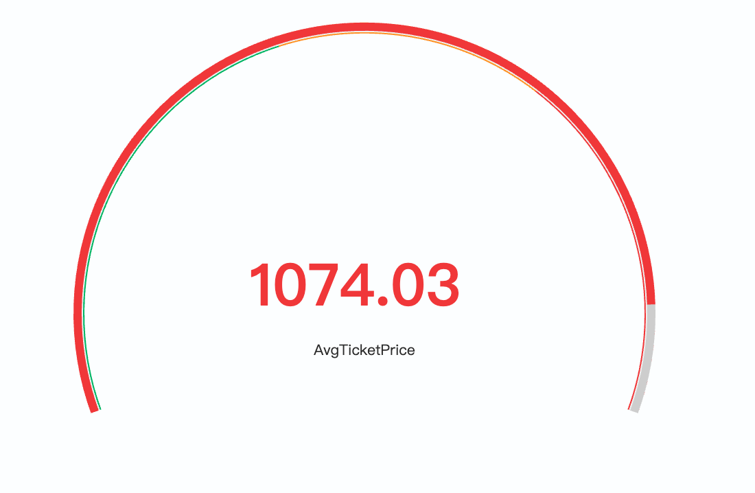
Using the same query as the previous example, open the Thresholds section in the settings panel and add thresholds. For example:
- Base color: green (values below 500)
- Threshold at 500: yellow (moderate price range)
- Threshold at 800: red (high price range)
The arc now shows colored bands---green up to 500, yellow from 500 to 800, and red above 800. Enable Use threshold colors to apply the matching threshold color to the displayed value text and the arc, as shown in the following image.
Customizing the gauge scale
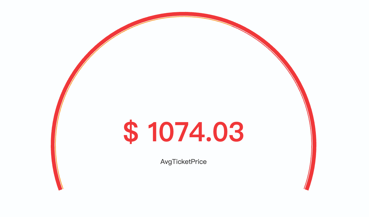
Section titled “Customizing the gauge scale”To monitor ticket prices against a fixed scale that represents the full expected range, open the Standard options section and set:
- Min:
500 - Max:
1200
The gauge now always spans from 500 to 1200, making it easier to compare across split panels, as shown in the following image.
Configuring a gauge chart
Section titled “Configuring a gauge chart”You can configure the following settings in the configuration panel.
Fields
Section titled “Fields”In the Fields section, configure the data fields.
| Field | Description |
|---|---|
| Value | Select a numeric field whose values are reduced to a single number using the configured calculation method. The result is displayed as the gauge’s current value. |
In the Split by dropdown list, select a field to split the chart into separate elements by value. For more information, see Split.
| Setting | Description |
|---|---|
| Use threshold colors | When enabled, the central numeric value adopts the color of the threshold range that the current value falls within. |
| Show title | Displays a label below the numeric value. Defaults to the field name, but you can override it with custom text. |
| Title | Custom title text displayed below the value when Show title is enabled. If left blank, the field name is used. |
Value options
Section titled “Value options”| Setting | Description |
|---|---|
| Calculation | Determines how multiple data points are reduced to the single value shown on the gauge. Supported values: Last *, Last, First *, First, Min, Max, Mean, Median, Variance, Count, Distinct count, Total. For more information, see Value calculations. |
Thresholds
Section titled “Thresholds”For information about configuring thresholds, see Thresholds.
Standard options
Section titled “Standard options”The Min and Max controls define the scale boundaries and interact with thresholds. When left empty, they are calculated automatically.
| Setting | Description |
|---|---|
| Min | The lower bound of the gauge scale. When the Min value falls within a threshold range, it acts as a cutoff---only the portion of the range above the Min applies. If Min is below all thresholds, the base color creates a base threshold starting at the Min value. |
| Max | The upper bound of the gauge scale. Thresholds above this value are not applied. |
| Unit | An optional unit label applied to the displayed value. |