Bar gauge chart
A bar gauge chart displays numeric values as horizontal or vertical bars against a scale, reducing each field to a single value. Unlike a bar chart, a bar gauge chart is designed for comparing values against defined thresholds.
Creating a bar gauge chart
Section titled “Creating a bar gauge chart”The following examples build on each other, starting with a basic chart and adding complexity.
Basic bar gauge chart
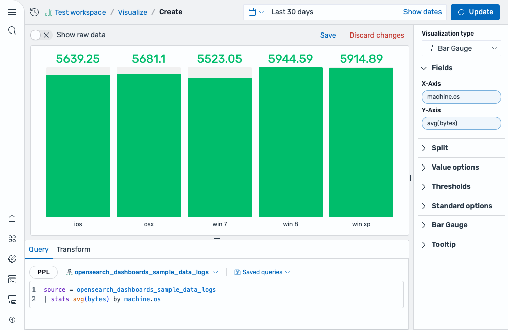
Section titled “Basic bar gauge chart”Start with a query that groups a numeric metric by a categorical field:
source = opensearch_dashboards_sample_data_logs | stats avg(bytes) by machine.osAfter running this query, select Bar Gauge as the chart type. The fields are mapped as follows:
- The X-Axis displays the
machine.osfield (categorical). - The Y-Axis displays the
avg(bytes)field (numerical).
The result is a set of vertical bars, one for each operating system, showing the average bytes for each. The Show unfilled area toggle is enabled by default, displaying a grey background behind each bar to indicate the remaining distance to the maximum, as shown in the following image.
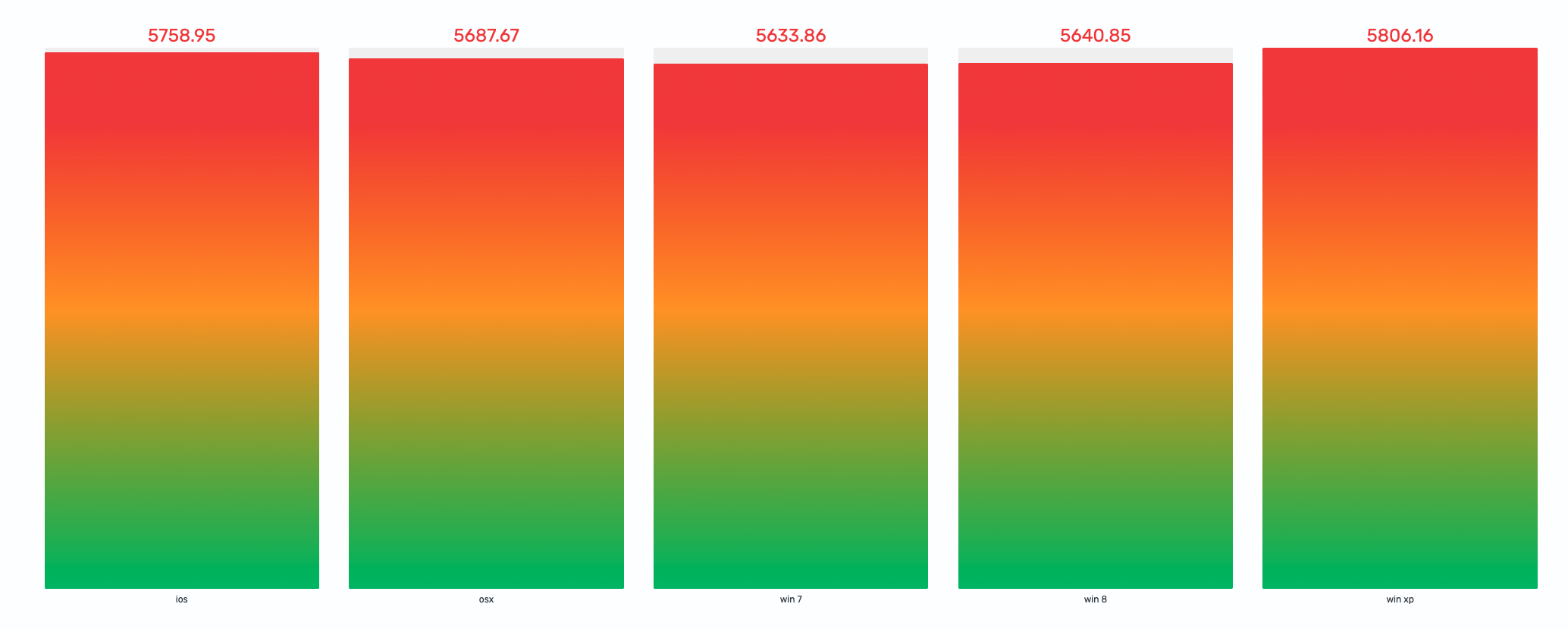
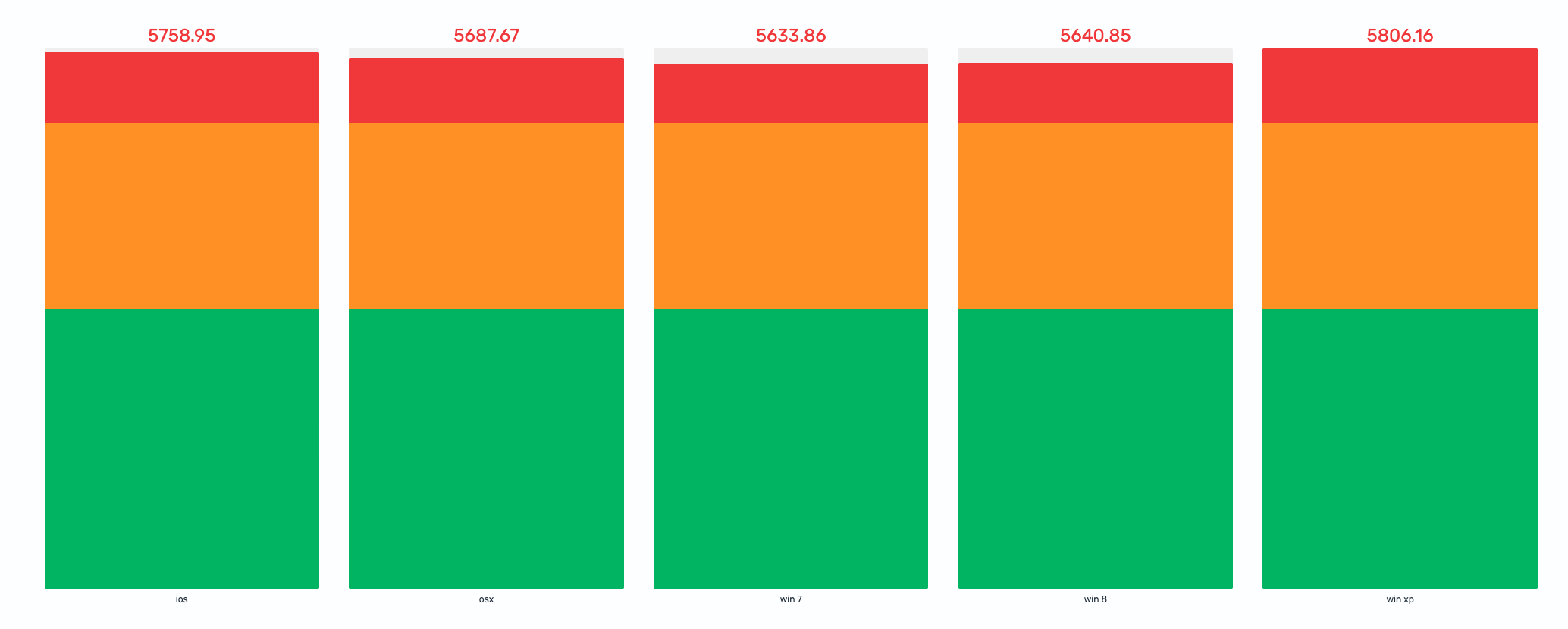
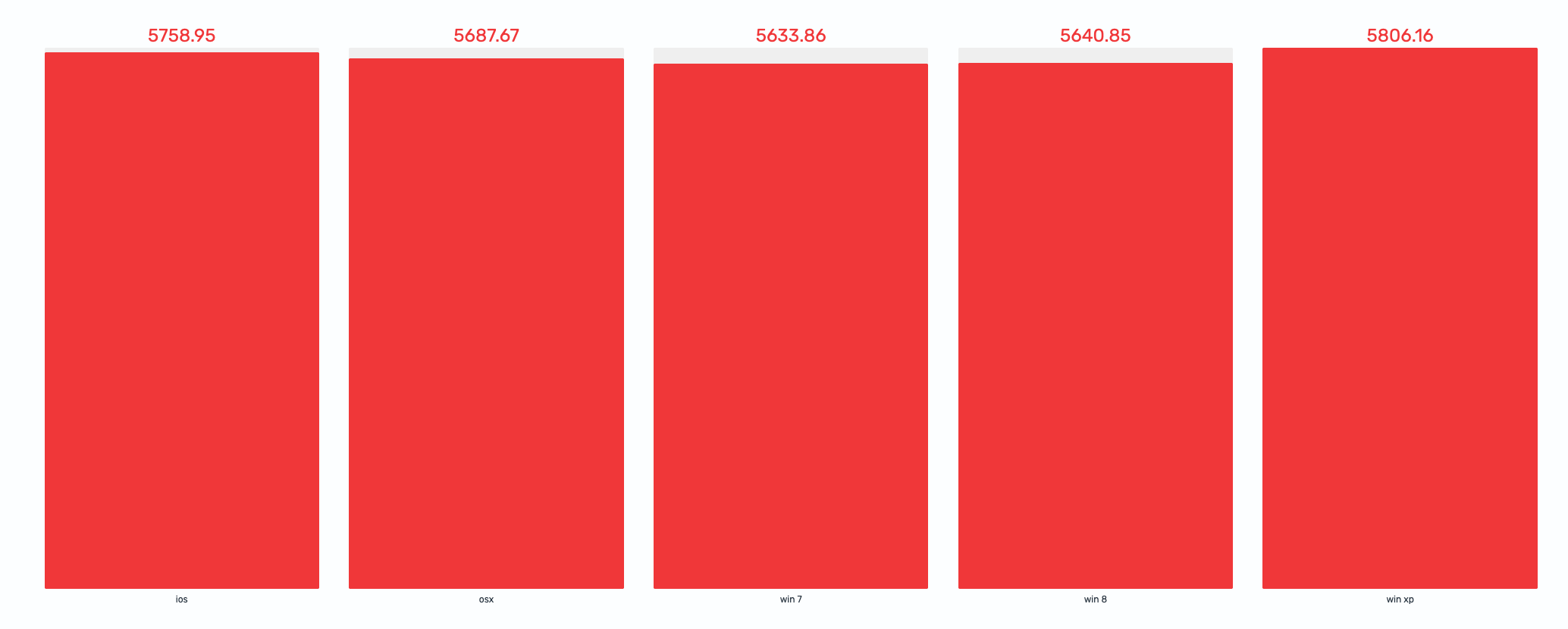
Adding thresholds and display styles
Section titled “Adding thresholds and display styles”Open the Thresholds section and define breakpoints to color-code the bars. For example:
- Base color: green (values below 3000)
- Threshold at 3000: orange (moderate range)
- Threshold at 5000: red (high range)
Then in the Bar Gauge section, switch the Display style to see different visual treatments:
Gradient---Each bar fills with a smooth color transition through the thresholds it passes, as shown in the following image.
Stack---Each bar is divided into distinct colored segments at threshold boundaries, as shown in the following image.
Basic---Each bar uses a single solid color based on the highest threshold the value reaches, as shown in the following image.
Configuring a bar gauge chart
Section titled “Configuring a bar gauge chart”You can configure the following settings in the configuration panel.
Fields
Section titled “Fields”In the Fields section, configure the fields displayed on each axis.
| Field | Description |
|---|---|
| X-Axis | Select a categorical field (for category labels) or a numerical field (for bar values). |
| Y-Axis | Select the complementary field. If X-Axis is categorical, select a numeric field for Y-Axis (and the other way around). |
In the Split by dropdown list, select a field to split the chart into separate elements by value. For more information, see Split.
Value options
Section titled “Value options”| Setting | Description |
|---|---|
| Calculation | Determines how multiple data points for the same category are reduced to a single value. Supported values: Last *, Last, First *, First, Min, Max, Mean, Median, Variance, Count, Distinct count, Total. For more information, see Value calculations. |
Thresholds
Section titled “Thresholds”For information about configuring thresholds, see Thresholds.
Standard options
Section titled “Standard options”Min and Max controls define the scale boundaries and interact with thresholds. When left empty, they are calculated automatically.
| Setting | Description |
|---|---|
| Min | The lower bound of the bar gauge scale. When the min value falls within a threshold range, it acts as a cutoff---only the portion of the range above the min applies. If min is below all thresholds, the base color creates a base threshold starting at the min value. |
| Max | The upper bound of the bar gauge scale. Thresholds above this value are not applied. |
| Unit | An optional unit label applied to the displayed value. |
Bar gauge
Section titled “Bar gauge”| Setting | Description |
|---|---|
| Display style | Controls how the bar fill is rendered. Gradient fills the bar with a smooth color gradient generated from thresholds. Stack shows distinct colored segments for each threshold range. Basic fills the bar with a single solid color from the matching threshold. |
| Value display | Controls how the numeric value label is colored. Value Color colors the text with the mapped threshold. Text Color uses the default text color. Hidden hides the value entirely. |
| Show unfilled area | When enabled, displays a grey background behind the filled portion of each bar, making it easier to see the remaining distance to the maximum. |
Tooltip
Section titled “Tooltip”Toggle the Show tooltip selector to enable or disable tooltips.